Disclosure policy

Thursday, June 30, 2011

Pretty Henrietta Paint

This is Henrietta, Annie Sloan's pinky purple colored chalk paint.
 It hasn't been seen much around blogland
but it is a color that I really like. 
Henrietta is even on the cover of Veranda this month!
I will admit I thought it was going to be more pink.
 When I opened the can I was kind of surprised at how purpley it looked. 
I realized that Henrietta seems to be similar to my pillars outside.
There were a couple of unpainted sections and
 I grabbed the can and went outside hoping for a close match.
 Indeed, the color was very close.
So I patched up a bit on the pillars and got carried away.
The iron bed got Henrietta-ed....
 The rusty finial stakes got Henrietta-ed...
 The broken water fountain window got Henrietta-ed...
 This bed was meant to be in Henrietta.
 The bird house got Henrietta-ed too. 
The little white conservatory is going to get some Henrietta as well.
This little can of paint is pulling together my garden in a very nice way!
Look what I found on Craiglist...
a three thousand dollar Pella window for $200.
 This window is 6 feet long~what a statement 
that would make over a sliding door. 
 I told Mr. Maison Decor that I walked all around the house 
and cannot find a place to install this window~our ceilings are too low. 
He then brilliantly suggested we start building 
our garden house with this pretty window! 
Woo Hoo! I called and offered the seller half price, and he said sold!
 So that will be in our possession by night fall! 
My dream garden and the little house is coming along...
I did a sketch of how it could look with the new window, 
an old stained glass window I have in storage,
and Henrietta pink plank doors and shutters.


Wednesday, June 29, 2011

Bedding fit for a Queen

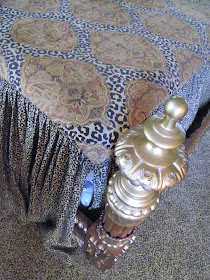
 This ornate bedrooom set is from Horchow Collection as is the bedspread.
Sometimes you need custom made items to finish off the look, and in this case 
my client wanted custom pillow shams that would be overstuffed and 
make a good backdrop for some elegant toss pillows.
 I suggested using a brown velvet and
designed a one edged cascading ruffled sham,
 so that when they were fit together,
 the ruffle fell to either sides of the bed.
We plan to cover the regular king pillows in
 dark brown cases so they blend in behind the shams.
Upholstery velvet was used and welting made for a polished look.  
An overlapping back method was used to insert the sham from behind.
 Extra stuffing was added to give it a full look.
Velvet is tricky to work with because it has a nap, 
and if you don't cut it all in the same direction,
when you sew it together it will look like two colors. 
Each piece needed to be marked for nap direction
prior to cutting and then referenced before stitching.

After finishing the shams I hit Home goods and returned  
to my workroom with an assortment of pillows I thought would
suit the bedding and the room's color palette 
and look pretty with the chocolate shams.
We didn't end up using the chocolate brown tosses, but kept the rest, 
after setting them up on the bed and seeing what looked best. 
Always buy more than you need, it is so much easier
 to return what you don't want, than to go looking for other options.

 I rarely make custom toss pillows because I am confident
 I can find great examples at Home Goods for a fraction of the cost,
 and in this case I was lucky to find tosses in luxe colors and styles.
 Coppery peach silk squares with giant 
peach colored diamonds in the ruched centers~
 Melon rectangle pillow with a triple ruffle embellishment
 was the exact color of the ceiling.
The tray ceiling is highlighted in a canteloupe color.
 Animal prints, rich dark woods with gold highlights,
 and citrus shades in rust, copper, brown, orange, and melon
make for a very exotic and rich bedroom. 
I was almost feeling like a Million Dollar Decorator!
 Beyond the armoire you can see the bathroom window treatment I did last year.
This bedroom set has old world styling.
Customized shams and the perfect find for toss pillows make this bedroom complete.
linking to 
Photobucket


Tuesday, June 28, 2011

Garden Wish List and Progress

Do you have a garden wish list?
  • rose arbor for climbing roses
  • garden house 
  • screen view of less attractive areas
  • contain hubs tools and such
These are some of the things on my list this year. 
I will be happy if I get one or two.
 I am determined to get a climbing structure for climbing roses. 
Never had one, always wanted one,
and when I found these pink salvage pillars I decided
 I would create an archway between the pillars
using some iron that will span the two pillars in an arched shape.
This is the spot where the archway will be built.
A white climber, White Dawn, will climb over these pillars
 and bring me much happiness!!
If it works out how I think it will, that is.
White against the pink pillars will be nice. 
I tend to plant flowers that are pink and purple,
 so the pillars will look at home in the landscape.
My garden looks a lot better in person...
or maybe it was just that we have had a lot of rain and it 
stole most of the blossoms off of the garden roses.
 My purple rose bush is right after the iron bed.
Planted against the iron bed are morning glories, and some sweet peas. 
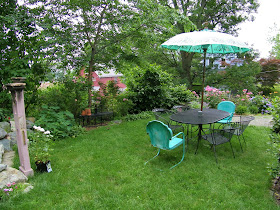
 I paired the vintage turquoise chairs at the table with the balinese umbrella.
My furniture outside gets moved as much as the inside stuff!
The tall black iron chairs are over in the back now with the chaise.
Look what I was painting yesterday and today...
a big honking orange tool trunk that my beloved brought home
 for tool storage against the back of the house here! 
(shown here after painting the bottom)
No way could it stay day-glo orange, 
so he reluctantly agreed to let me paint it
 so it would blend in with the house. 
Now all of his things can get tucked inside this
 grey box and maybe we both can be happy.
I also painted the white rocker black,
and picked up a small iron umbrella table at Costco 
to steady the wind blowing the new black umbrella on the upper porch.
It is quite a welcoming spot.
My hydrangeas have just exploded!
 These will last me all summer long with cuttings.
A fair amount of weeding was done 
 on the charming but pain in the neck gravel walk.
I let it get away from me already...
My reward? 
A chilled glass of white wine and some reading 
about lovely garden structures at this book I got at Lowes.
PS~Don't forget to watch 
Million Dollar Decorators tonight!
Did you know that decorating diva Mary McDonald even read my post
and thanked me and then retweeted it on twitter!! 
That was very cool~
I will be watching her every move!


Saturday, June 25, 2011

Million Dollar Decorator's Design Stars

This show on Bravo is my new addiction.
Watching faithfully every Tuesday night I 
have come to some conclusions after the third episode.
 This is my review on MDD.
The show has two designers who are more talented 
and more entertaining than the rest of the cast.
Lets meet them~
Kathryn Ireland
a British designer, has a decorating style I call English Bohemian.
Her showroom of fabrics have every color in the rainbow, 
and lots of exotic patterns that exude happiness.
Her fabrics have swept Los Angeles by storm, 
and the Indian prints in particular seem suited to the West Coast life style. 
I love how Kathyrn mixes it up with color and pattern~
 I adore this room. 
She is a master mixing scale and color.
What a happy room,
 and the dark furniture keeps it from being sacharine. 
Another one of Kathyrn's brilliantly mixed bedrooms.
She loves using oversized patterns with geometric and odd ball colors.
This is Kathyrn's kitchen and it suits her to a tee.
 I love the painted green cabs with pops 
of bright color and the dark floor to ground it all.
Kathryn can do a softer palette nicely too.
Bohemian and quaint in that English way.
On the show I just love watching her! 
She doesn't "look" like a decorator, or "act" like a decorator...
she seems quite ordinary and average and you can't help but love her.
It is fun to see her in action running her business, running late to meetings,
and being a single mom to teenage boys.
There is a lot of drinking in this show.
Having clients with megabucks and
 mega-expectations can do that to anyone.
"Chardonnay, please"
Kathyrn seems to like drinking with Martyn the most, 
as they are design buds and good friends.
They share their projects and talk design together.
Here I bet they are talking about her client Shannon.
Kathryn has been decorating two houses
 for a client named Shannon Factor
who married into the Max Factor fortune.
Shannon Factor has lots of expensive stuff
She has rooms and garages filled to the brim
and she wants Kathyrn to figure out how to use all her things.
This is quite a task, but Kathyrn can handle it.
Kathryn says plainly that Shannon's house is a monument to bad taste. 
Besides being talented, she is quite hilarious, 
and in this scene she is actually trying on used bras at the flea market. 
Her double D boobs get a lot of 
comments during the show from her fellow decorators.
 I love seeing what she wears, she shows up in the plainest of clothes, 
and then she will appear in a mod caftan
 or an eyelet mini-dress flaunting her womanly figure. 
You just have to love a woman like that! 
I can see hanging out with K, drinking wine 
and laughing our butts off dishing about Shannon. 
Another thing she has going for her is she has dogs and kids. 
I think both of those things round out a person...
and if you don't have kids you should at least have dogs!
Kathryn and a typical morning  in her house I imagine~
lounging in the family bed. 
This is so Kathyrn!
Maybe you are starting to get the picture about Kathyrn 
and her colorful Bohemian English ways...
She is a super talent.
The other design star on Million Dollar Decorators
 is just about the opposite of Kathyrn.
It is kind of like Ginger and Maryanne on Gilligan's Island.
Ultra Design Diva,
 Mary McDonald.
 Seen here with her assistant who is always
 doing the opposite of what Mary wants.
 If she were my assistant, she would be no longer in my employ~
 but clearly I can't afford to have an assistant,
so that is just a guess on my part.

Elegant Mary is very dramatic and in the first episode I thought she was a monster.
 After her client confided in her that she was now going through a divorce,
 Mary shouted, oh no, you can't sell "my house". 
No words of compassion to her client/friend.
 Mary, that was ugly. 
I am hoping it was editing that made Mary look like a monster.
 She then told her soon to be divorced client that 
she had to decorate the guest house on a full budget,
 not a reduced budget, 
otherwise her client should use catalogues
 to decorate the guest house!
 Mary proceeded to buy tons of expensive unnecessary accessories 
to decorate a guest house that was going on the market.
I had all but washed my hands of Mary..
and then epsiode two and three came along. 
I turned into a Mary lover. 
She has fabulous style, 
and she wasn't really that mean after all.
She was kind of sassy and funny.
 And she has dogs~look at these cuties! 
She has to be nice.
Mary's style of decorating is what I would call Modern Glam.
 She seems to use a formula for every room she does.
 She says she doesn't, but I have noticed she uses 
a dark neutral and a light neutral and then often adds one bright color.
 For example, chocolate and cream (and orange).
Or Black and white (and hot pink). 
The other part of the formula Mary uses is there 
is always a wide stripe, and some animal print. 
Lets see if she stays true to her "formula" in the future episodes.
This was the latest room she created for a clothing design diva named Jill.
 Now Jill was very cute, but kind of a spoiled brat, 
and Mary had her number. Jill hated the diagonal striped floor
 before Mary got to decorate the room and fill it up
 with the rest of the furnishings and accessories. 
I hated the price of the diagonal floor~at a cool eight thousand dollars,
 I thought of quite a few design bloggers
 who could have painted that floor for a fraction of the price. 
At any rate, in the end Jill was thrilled, 
even though Mary said she wanted to strangle her during the project.
 "Stop taking the paintbrush out of my hand while I am painting",
 she said to no one in particular 
(well it was said in front of the Bravo tv camera crew) 
and I thought that was the most brilliant thing I had heard anyone say. 
YES! Let the designer do her designs....then you can weigh in at the end! 
Anyway, I love what she does to rooms. 
She creates drama, and mood 
and she does it in an elegant way~her rooms are always classy. 
Mary had a book published last fall, 
and I am going to get myself a copy, because I think 
Mary  is a super design star!
Two talented designers showcasing 
how they design in an entertaining format.
Being someone who makes a living being a designer,
it is soooo much fun to see how the projects are 
on the million dollar scale.

Signing off  with this review,
yours truly, 
The Multi-Dollar Decorator