Disclosure policy

Friday, March 25, 2016

My Cottage Kitchen

 Welcome to my cottage kitchen, I am excited to show you around!
 Its a very tiny space and so "Cottage Style" works best.
I love French style, and so let's say its French Cottage Style!
I am joining some French Country bloggers in a one room home tour,
which is such great fun. Check the links at the end of the post!
My kitchen is the room I rarely share, and so 
I hope you enjoy getting a peek at it today.
It is in the center at the back of our home and is connected by three
hallways which makes it a busy place. 
 From our front door you can see our kitchen at the end of the hall 
where I recently hung up some vintage botanical prints.
The butcher block island by John Boos company is the workhorse of the kitchen,
and its where we do most of our meal prep and also where I like to display things,
like fruit and vegetables in pretty dishes, like this purple transferware.
Part of my transfer ware collection is in an open cabinet space above the kitchen stove.
Various collections are found in our kitchen, like these vintage fruit 
and vegetable molds that I bought at the Brimfield Antique Fair last year.
By the way, I will be a vendor at the Brimfield Fair this year with my son, 
Justin Power, and I hope you come see us at the New England Motel Field #40
 if you plan to be headed there this May10-15, 2016!
You can find all kinds of awesome things to decorate your own home with,
like I have done over the years. Although our home is newer, I switched out
our sink for an old drain board style porcelain sink, and I think it is one of
my favorite improvements that Mr. Maison Decor and I ever did.
Our countertops are the Formica FX brand that looks like marble, but isn't,
although I wish they were....
And lastly, my kitchen cabinets are maple, and I painted them 5 years ago 
with Annie Sloan's Old White Chalk Paint and then I clear waxed them
and they have held up very well indeed.
Our dining room is on one side of the kitchen, and that doorway you see
leads to our basement where we have an apartment that our various kids
have lived in over the years.  There is one unpainted section of wall next
to the door that has all of our son's heights and names with dates.
I cannot paint over it...its too meaningful of course, and its fun to see how
 much our youngest in particular is growing these days!
Then to the right you can see the front hallway again and the room to the right
of the photo is our family room, which is really "man town".  A room filled
with leather couches, a giant tv, burlap curtains, a dog kennel and 
lots and lots of cowboy hats hanging on the walls.
Its a hop and maybe a skip, but not a jump to come into the kitchen 
to cook popcorn on family movie nights!
 Our newest addition to the kitchen area is this fantastic farmhouse style mirror.
  I am in love!  Its called the Reproduction Louisville Mirror
 and I got it from AntiqueFarmhouse.com.  
They have home decor accessories 
with so many things for your pretty cottage or rustic farmhouse look. 
 I have a thing for mirrors and use them for wall art, more than any other kind of item.
Big statement mirrors are so versatile, and while I first thought I would put it in the dining room
I decided it looked perfect with my white kitchen cabinets and its rustic distressed finish.
Statement pieces are usually large items that denote a decided style to a space.
I can see putting seasonal wreaths on the mirror during holidays,
or just tiny accents, like this cute burlap and moss bird.
See how our kitchen is tucked into the connecting hallways?
You can see into the dining room from here, where we just added our French doors.
And my fun new addition, the old French day bed that is waiting to
be put out into the courtyard....but that is for another day!
I hope you enjoyed this tour of our tiny but charm filled kitchen.
When you don't have grand rooms, makeup for it with charming
and personality filled accessories.  That's what I do!
To visit the Antique Farmhouse online shop, click here.
It was so much fun to join with my design blogger friends for this 
French Country Blogger's House Tour.  
I am off to see what rooms they are highlighting today,
and you can visit them as well by clicking on the links below.


 photo signature_zpsxi5q1w6r.png
Note: This post is partially sponsored by the AntiqueFarmhouse.com however all thoughts and opinions are my own. 

Thursday, March 24, 2016

Pretty Easter Centerpiece

This is a good centerpiece idea for last minute table decorating for Easter.
Maybe some of you are like me this year....a bit behind the eight ball?
Matthew Mead and I love to set a pretty table, and it starts with the centerpiece!
When you hit the grocery store buy some white eggs and some spring flowers.
You will need some moss or grass as a  "covering", and in this video
we used sheet moss from Walmart, but you could also use Easter grass,
or make your own grass by shredding your own colored paper.
Check out this quick 2 minute tutorial on how Matthew and I 
recycled my Costco Christmas planter into a darling Easter decoration.
We filmed this at my dining room table...and when Matthew left he took his gorgeous 
blown eggs with him! So all week long I have been blowing out my eggs and having omelets
for breakfast each day.  I plan to paint up the group for my own Easter table this year.
But that won't be until this weekend...so I will share it after the holiday.
Wishing you all a very nice Easter, from Matthew and myself.

 photo signature_zpsxi5q1w6r.png

Monday, March 21, 2016

Pretty black floral desk

 
Last time I blogged, I spoke about how my grey industrial work table
just wasn't working for me in my home office/studio.  I said I was likely
going to go looking for a French style desk or writing table.  But then a funny
thing happened after I did a run to Michaels craft store for some supplies.
At Michaels, I noticed some very pretty black floral drawer liner papers. 
I bought two boxes of them thinking I might use them to cover books or line the back
of my china cabinet/bookshelf in the office as an accent.  But then it struck me!
Use it as a covering on the old worn out desk top!  Simply applied with 
some Mod Podge (a glue type product for sticking and sealing), I first decoupaged
the table top.  Then I kept going....the legs and the sides and it just kept 
looking better and better! 
It was a quick and easy project, that I would say is beginner level.
On another whim, I added a few cutouts of the paper where the lilac stripe met
the beige wall, and I let it "drip" down between the old french plates.
I applied this with a Tacky Repositionable Spray
 (I use it for holding stencils in place normally),
 so if I want to remove it I can, as I wasn't sure I would love it. 
 But its pretty and whimsical and it is staying for now and I am in love with my office!
This decorative paper really turned this masculine 
old work table/desk into something I think is very chic.
And in case you forgot what the old desk looked like...
Here it is in it's before state, a stained linoleum top on steel frame.
The style was just too far away from the French look I had going on.
The white modern chair was enough of a "modern mix", 
and yet the table wasn't doing anything but drag down the space.
Voila!
A little creativity and some decoupage rescued this table and turned 
it into the star of the room.  Think of how you can create personal style using this
 idea in a kid or teen's room, or your own private space like I did.  However,
I wasn't sure what people would think...so I shared a little peek on Facebook.
It seems people love it too!
Just when I thought I might be crazy, Courtney Allison, 
 asked me if I had seen the black floral desk from designer Cynthia Rowley?
Well no, I hadn't, and after a quick google search I found it!
Modern lines, and a bold pink and black floral!
Its in her new collection with Hooker Furniture....but hey, how about
you make your own with your own favorite paper instead?
I did mine for less than $15.  Her desk is a little less than $2000.
Haha, now that is amazing!

 photo signature_zpsxi5q1w6r.png

Thursday, March 17, 2016

Lilac for the home office and other random bits


 This is one of those catch up posts, loaded with new additions and updates!
With Easter fast approaching, it seems Spring will be here before we know it. 
And when Spring arrives I will be having two photo shoots at the house,
one which will be with Fifi O'Neill for most all of the house, and then a separate one
for the magazine, Where Women Create.  That is a very cool magazine dedicated to 
showing off creative women in their habitats. And so, my home office will be 
under a magnifying glass and I want it to look beautiful, and more "me".  
Walking down my hallway, heading to my home office is this
lilac striped wall that leads into my work space.
 The walls here have been painted "French Canvas" by Ben Moore, which is a very
nice neutral.  I added a sisal rug from Ballard Designs and matchstick blinds
and some drapery panels that have a beige and white scroll pattern.  I wanted 
a little more personality than those neutrals had to offer so I painted a wide stripe around
the top of the room in "Majestic Mauve" by Ben Moore.  Its soft and subtle
and ties in the view to the hallway. Lilac, the soft version of purple, is best used in 
limited amounts, and I have always loved the color since I was a girl.
 This Aura paint is awesome because it has no smell, and after years of using
 Annie Sloan's Chalk Paint, that was something I never wanted to go back to...
the smell of latex paint.  One coat coverage makes it a good  choice, 
although it is premium in price, I think its worth it.  
(And no, this is not a compensated post, this is just my opinion on paint.) 
Before I had my china cabinet behind the desk, and it was a bit cramped when 
it came to the function of the space.  So I decided I would move it over to the side
wall and try a console table and artwork along the wall.  
 I framed a large needlepoint in an antique frame I had and as soon as I hung 
it up I kind of hated it.  UGH. You know its ok to try stuff then try other stuff....
then I got the idea to steal the huge grey mirror I had recently bought for the kitchen wall!
Here is my wonderful grey mirror from HomeGoods.  
Do you ever think of shopping your own house for the perfect thing in another room? 
 I couldn't resist moving it...my hubs thinks I am nuts.  He was the one who had to move it, or I would have myself and he likely wouldn't have noticed.  I do have a very neat farmhouse style mirror coming any day from Antique Farmhouse that might look great in this spot, but I will cross that decorating bridge when I get to it. 
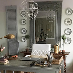
 Anyway, I loved how it looked in my office behind my grey desk!! I hung up the French black and white transferware plates I recently found while antiquing, and then added shutters next to the plates.  The room is getting more changes, but at this point I am feeling encouraged. The pale lilac stripe is just fun and unexpected.  Oh, and I also repainted my orb chandy from Gold to Pearl, using Matthew Mead's Studio Metallic Paint.  I think that made a big difference as well.  Now I have the urge to hunt down a French style table or desk, as this old utility desk is just not working for me. 
Stay tuned on that one....I hope I will get it all together for a final reveal within a month.
 In the meantime, Mr. Maison Decor dragged home an enormous piece of granite, that was about six by three feet in size, and we place it in front of the French Doors leading to the back courtyard.  It is really going to be amazing, when I can get outside and start working again on the courtyard and making it all look beautiful for our outdoor living.  I am super excited about that!  I want to sew and install a Sunbrella canopy awning over the back doors, and I also want to build a small garden folly, which I can store garden tools for easy access next to my vegetable garden.
 In anticipation of Fifi's arrival, I searched online and found some beautiful vintage linen napkins, French of course.  I got a set of eleven, and they are huge, about 28" square!  I have heard them called "lapkins", which I think is very clever.  They are monogramed with a D V it appears, and if you flip them upside down it looks like an A C, which are my initials.  No matter, I have always wanted a set of nice French linen napkins, and now I have them, and they will set a lovely table.
 Almost every room in my house has spring flowers, I have been unabashedly buying them
when I have been shopping at Trader Joes and even Costco.  The former has beautiful pansy bowls and potted pink and blue hydrangeas right now, so get them while you can.
I bought two of these, one for me and one for my mother-in-law.
Aren't they gorgeous?

 photo signature_zpsxi5q1w6r.png

Thursday, March 10, 2016

Create a Botanical Wall Grouping

 Botanicals are a classic in home decorating and have been for years.  
Never out of style, they add a bit of garden ambience to the home.
For a while I have been wanting to create a wall grouping of botanicals.
You can purchase vintage or new botanicals online at Etsy.com or Ebay, 
or maybe you have a large garden book that you can color copy the pages
or even tear them out and use them for a coordinated grouping.
 My botanicals were issued in the early 70s from the Smithsonian Institute
 and are part of the Wildflowers of America collection.  My sister picked them
 up at a thrift shop for .50 cents for the entire collection of about 20 prints. 
 The prints were 9" x 12", and so I went on the hunt to find some frames, 
in hopes that I could avoid having to get them custom framed.
These Studio Decor frames are in a grey wash and are made from Ash.
They also came in natural and white, and I found them at Michaels Craft Store.
They were on sale and ended up costing $5.95 each, so I bought 9 of them
to give me the options of having a 3 over 3 frame layout on the wall, or do 4 over 4,
and because I really was unsure where I was going to hang them.
The size of the frame was hard to find, and it still wasn't perfect because
 I guess 9x12 is an odd size.  Most frames were 10x12 or 12x14.  
But this frame came with a matte, so I decided I would play around with it 
when I got home.  I could float the entire image over the matte, 
or hide part of it under the matte, and that is what looked best, although
 the text had to be hidden.  And that part of a botanical is wonderful, I know,
 but it looked much more professional using the matte.
Its super easy to do....just pry up the little metal clips and take out the back board 
and the matte, and then using the Glue Dots (also from Michaels)
on the backside of the print, I placed it on the board and 
checked to see how it looked with the matte on top of it and that it was centered.
It was a simple and fast process, and in no time at all I had 9 framed botanicals!
So many places these could have been hung, but in the end I decided to
 hang them on the narrow wall that leads from my kitchen to the front door. 
 We don't have wide hallways, so this grouping adds a pretty note
 without taking up tons of space.  
 I suppose I could add another row underneath, and I just might go back
 and grab some more of the frames before they are all gone.
 The view looking back into my kitchen...
 And this cute view looking towards the front door.


 photo signature_zpsxi5q1w6r.png