The last two days have been spent doing
a photo shoot with my new DSLR camera.
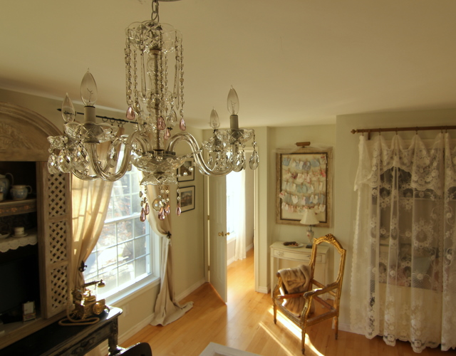
To get this picture took two days!
I know, I know....
seems like a long time to get one decent photo~
but there is more here than meets the eye.
First of all, notice the chandelier~
This was the first day with the new camera,
and there were things that I suddenly noticed that bugged the crap
out of me that I hadn't taken care of yet.
Like the naked chandelier.
Over time I had stripped its crystals to use on other chandeliers
and I just forgot about how pathetic it looked.
You will also see that these photos will vary between two color tones,
one will be a cool and one will be a warm.
I was practicing with settings on the camera because I was lucky enough to get my son's college friend, Brenda, who is a photography major, to come help me figure some of this stuff out! She was home for the holiday break and I had arranged to have her come by with her camera and take some shots....but then I bought my camera and so we used both my Canon with a new wide angle lens that she rented, as well as her Nikon! A lens like this goes for as much as my new camera! A whole new world was opening up with the wide angle lens. Wait till you see how amazing it is~you can capture an entire room in one shot. This will be on my list to purchase for sure.
Brenda with her Nikon, shot in a hurry by moi, with my Canon.
I wanted to get better pics of the entire office,
as well as this area with the Shabby Chic Soho samples.
This was one of our favorite shots from the first day.
Brenda taking closeups of the table top.
After all of that, we decided that the pink flowers were too bright
and we would take the whole thing over the next day.
We were running out of daylight.
The other thing that bothered me was the big heavy black rod. it was very bossy~so I decided I wanted to switch it out for a gold rod to go along with the softer feeling of the Louis Chair and the Soho sample board. The other thing that bothered me was the plug outlet above the basket, and that the basket looked busy with the chair...arg. So the basket would leave and I would hide the outlet by tucking a vintage fur stole on the arm of the chair.
Day Two
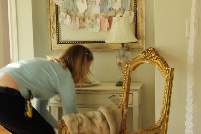
Draping the fur on the chair~you can see the walkie talkie on my hip~while I was busy hanging crystals and changing out the rod upstairs, Brenda was downstairs shooting the kitchen.
Here you can see the rod has been switched out for a historical gold number. It was a leftover custom wood rod that I asked hubs to cut down for me that morning so I could quickly get it mounted. Brenda shot me in the hallway getting rid of a stained glass window propped up on the hall window sill, but it was distracting from the shot.
The chandelier got an assortment of vintage crystals from my stash.
I decked it out with round beaded garland, crystal prism garland,
different types of prism drops as well as a few new pink crystal prisms.
Now we were ready to take some wide angle lens shots!
Brenda is on a ladder in the corner of the room while I am "directing" the shot! It was a Spielberg moment!! Or a mini Martha Stewart moment!! Hah! You can see our camera lens and stuff on the table behind me. I want Brenda to capture the front of the room with the windows and the hutch.
But then Dillon strolled in...
And decided to sit down.
I tried to get him to strike a pretty pose,
but he just wanted to look like a pit bull. Go figure.
The day before Tobey kept coming into the room~
I was constantly shooing him out. I needed the door open
to gain the light from the hallway.
Its a dogs world alright (at least at our house).
After two days of playing with settings and taking photos
nonstop we ended up with some pretty detail shots
and some nice overall room shots too.
My frenchy phone looked pretty on the rustic desk with the sunlight hitting it.
What is interesting is that you notice things that bother you
after you look at them on the monitor...
like I did not like all of the black legs on the stacking tables.
Here Brenda is checking the images on the monitor.
So we switched out the tables for a basket.
A basket replaces the table to conceal wires that run along there.
The camera focuses on the crystal chandy
in this pic was taken from the top of a ladder.
We loved this image~very dreamy and light.
And this one too...
Here is the same pic on the largest setting for the blog post,
but as you can see from above, it cuts off the edges of the pic.
However this is from the wide angle lens,
and look just how much it can capture in a room that is 17 feet wide.
So this is what I have been busy doing for the last few days.
I will share other rooms as I get them edited.
Like this kitchen shot~!
I love the wide angle. Need to work on getting crystal clear images.
Like this one...
So much to learn, and it is going to be incredibly fun!
I owe Brenda a big fat hug and kiss for helping me these past two days.
You can see her passion for photography~


