Friday, March 28, 2014

Embellishing mirrors with appliques

 I love the look of beautiful mirrors encrusted with layers of moldings.
So this idea of using a nice enough mirror and then building it up
with layers of moldings was hatched.  
Using the latex moldings and appliques,
my intentions to channel the inspiration mirror, below.
I particularly liked the way the moldings were laid over the mirror part.
The contact cement used to apply the Efex latex moldings will attach
the molding to glass and mirror as well as wood or composite.
 Here is the layout of the Efex moldings. I played around with a few
combinations and started laying them out and drew a sketch
so I would remember how to reassemble.  I took a few pics as well.
Now they would all come off and get painted then glued then returned
in order of bottom layer to the top.
 I have used both latex paint and Chalk Paint on these
moldings in the past, and for this project it was the latter.
A coat of Old White and these babies were ready to be glued as soon as they
dried.  I traced the moldings onto the wood frame and the mirror using a lead
pencil, then applied the contact cement on the back side of the molding as well as
onto the glass and the wood frame.
 After waiting 20 minutes I repositioned the moldings onto the mirror and the frame. You can see the yellow glue. After this dries in about a half hour, it can be painted and you will not see the glue.
Regular glue or hot glue will not work on latex moldings. These latex moldings are flexible and are a joy to work with as they can bend over the ridges of the mirror.  To remove any excess glue on the mirror use a bit of mineral spirits on a cloth to dissolve the cement. 
The finished mirror made more beautiful 
with layers of applied Efex moldings.
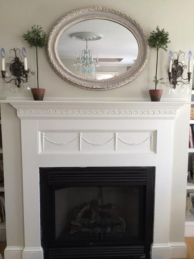
I think I have the perfect spot for it~
right over this mantle that I did earlier this month using a combination
of Efex latex moldings.  Don't you think it will look amazing?!
Create some magic for your home by adding some Efex.
I can't wait to hang my "new" french mirror!
 I grabbed this charming bowl of roses at  my last visit to HomeGoods.
 It adds a bit of romantic cottage style to the living room.
Look for the mantle-mirror reveal next week!!

Photobucket
Disclaimer: Part of this post is sponsored by HomeGoods Happy by Design Pinterest program.  
All designs and opinions expressed on my blog are my own.
Read more »

Sunday, March 23, 2014

Styling a mantle with lanterns and florals


Its that time of year when spring is approaching and we need a bit
of freshening up in our homes.  One easy place to start that makes a big
impact is the mantle above the living room fireplace.
The mantle can make or break a room! Its usually the focal point of 
any room that has one, and if you are lucky you can get away with just
changing the decor around a mantle to keep you in the style as the seasons change.
This home I am currently styling has a big open floor plan with high ceilings and a 
monochromatic neutral color scheme of mostly white, cream and grey.
Everything is over-scaled so to make an impact I kept it simple.
To soften the stone and the lines of the mantle I added a 
few different types of faux floral stems in white and tucked 
them around some different sized white washed lanterns with silver tops.
I found my florals and the lanterns all at my local HomeGoods.
The before photo of the mantle shows a restrained grouping of white vessels.
Its all a bit too shiny and hard between the polished granite surround and glossy mirror~
so enter the vines and florals to change that.
The simple addition of florals across the mantle softened the entire room. 
 The three lanterns in varying sizes make
 a nice cohesive arrangement with the florals 
woven around them.  A stone owl with a bit of faux lichen
 sits in the center, nestled amongst the vines.
These lanterns have staying power~when fall arrives the florals can be
changed out for an autumn leaf garland with berries.  When 
Christmas arrives, little white lights in a faux green garland 
would be very pretty and classic.
 Fill the lanterns filled with shiny silver ball ornaments
 and your mantle is ready for the holiday season.  
Who doesn't like things to be easy and chic?
The mantle is just part of this room that I am still working on.
 I will be back showing off more spaces in this beautiful home.
Follow along as I  accessorize it with items from
 HomeGoods and Maison Decor.


Photobucket


Note: This post is sponsored by HomeGoods Happy by Design Pinterest program.  
All designs and opinions expressed on my blog are my own.
Read more »

How I Found My Style Sundays

How did I find my style?  What is my decorating style?
 What things do I love best in my home? 
What tips can I give those interested in their own pursuit of home decorating? 
 I was invited to answer these questions for Pamela today 
as a guest blogger at From My Front Porch to Yours:
  How I Found My Style Sundays.

How I Found My Style
   The funny thing is that I find my style is always in a progression of change. 
 Its not a static thing for me, and maybe you can relate to that....
or maybe you do things once and the room stays like that because its "done"? 
My style is in flux~ever changing. Want to hear more?
Head over to Pamela's to read more on how I found my style!
Shabby Chic Cottage Style
Did I keep this look, or change it out?
Find out more....
Photobucket
Read more »

Friday, March 21, 2014

Use Foil for an easy Silver Leaf finish!


 Aged silver leaf on a cabinet is a beautiful look.
Want to get the look without the hassle?
Our lovely cabinet was not so lovely to begin with,
take a look at its transformation.
This wood cabinet is an old stereo cabinet.
The front panels had cracked decorative panels that we removed.
Next step was using Annie Sloan's wonderful paint to cover.
We used Graphite Chalk Paint for the base to our silver leaf effect.
After the paint dried we applied a coat of Artisan Enhancements Leaf and Foil sizing.
Its like a watery glue that you paint on with a brush.
Colin and I painted the sizing on together working from either ends
of the cabinets.  We were undecided about the panels so we did not
apply the sizing inside the paneled area at first. Later we changed our minds
and did size that area as well. Wait for the sizing to dry to tacky status,
about 45 minutes.
Then start with a sheet of foil that will cover an area.
Foil is thin and on a roll (you can see it on the floor next to me).
It comes in silver, champagne and gold.
Where ever you paint the sizing on is where the foil will stick.
I roll off about 18" and then stick it matte side to the sized area.
Then rub it on with a scrub brush or a dried sea sponge to make good contact
before you peel the sheet of foil back.  The metallic foil will stick to the cabinet
and the sheet will come off almost transparent, as you can see above.
This is soooo easy and fast! Foil doesn't flake like silver leaf and you can do
large sections at a time, making this project go very quickly indeed!

Rubbing it on, peeling it off~this is the look.
You will see the brush strokes of the sizing and it creates a 
very natural leafed effect.
After a bit of debate, Colin went ahead and foiled the interiors of the panels.
Then he selected a stencil and used Graphite Chalk Paint to go over the silver.
Look at how amazing this looks!
Our stencil pattern was Royal Design Studios Small Eastern Lattice.

You can see how it looks after Colin finished the first door,
After it was all finished he protected it with Artisan Enhancements Clear Top Coat.
We use this over special finishes, like foil for a clear protective coat.
You can finish it with Annie Sloan's clear soft wax but it will dull down the foil.
Finished silver leaf effect cabinet!
Finished in one day! Hooray!
To see how easy it is to apply foil,
watch the quick short video below.

Photobucket
Read more »

Sunday, March 16, 2014

Home Decor Palette: Neutrals plus One


 Create a beautiful and welcoming room by combining neutrals plus one. 
 One color, that is.
This oversized family room was furnished with neutral furnishings and wall color
and was in need of some finishing touches.
My client, Anna, asked me to help make her home a little more inviting. 
 She was enjoying her neutral palette, but felt something was missing. 
Accessorizing was needed to make the space feel cozy and 
 a soft repetitive dose of aqua would be the cure.
I am a HomeGoods designer for their Pinterest board, Happy by Design,
as well as the shopkeeper for my own decor shop, Maison Decor.
Anna's house would be treated to a nice makeover after a shopping trip
to both! Here are my carriages filled to the brim with goodies for Anna.
I recommend buying more than you think you need, so you have enough
to play with when you start styling your space.  
You can always return what you don't end up using.
This room was big and larger spaces need more stuff!
 Ana had a pair of tufted taupe linen wing backs set in front of a window.
There was a teeny tiny table with nothing else between the chairs.
An antiqued gold bamboo style metal and glass occasional table was 
the right scale and height for the chairs.  A tall modern aqua glass lamp
with linen shade united the pair into a cozy conversation spot.
 Chic silk beaded pillows added a little glam to the linen chairs.
It's a great improvement to that pair of beautiful chairs.
 Other touches of aqua were added in the form of
 candles inside lanterns and candle holders.  
A gorgeous aqua and taupe embroidered designer pillow
 from HomeGoods was irresistible in both price and style!
 The neutral palette was also punched up with metallics.  Lots of sparkle~glass and fabric,
 from the crocodile ottoman tray, mercury glass, and extra pillows on the sectional,
all found at my local HomeGoods.
Did I mention pillows??
I call this Pillow Magic! 
Pillows are the quickest way to create a change in a room.
 Little shots of aqua were placed around the room,
 on the table tops, inside the bookcase and on the sofa.
Washed willow storage baskets from Maison Decor were
placed up on the bookcase next to a pair of silver lanterns from HomeGoods.
Large rooms need larger scaled accessories.  
This enormous peacock oil painting in shimmering champagne
 with a touch of white and aqua was the perfect addition
 to the wall behind the sofa,
keeping the mood modern and dramatic.
 Anna found the fabulous floor lamp
 at West Elm after we spotted a similar style lamp while 
scoping out Pinterest for inspiration.
 A reminder of the before....
(oh and yes we are getting rid of the brown rug that 
doesn't work and installing a wool carpet in pale sea glass aqua!)
The after shot shows how pillows and a few well chosen items like lamps,
 smaller tables and sparkling accessories has brought this room to life!
 Not to mention, the addition of color.
 One color. 
Aqua.

(Stay tuned for both carpet and draperies from 
Maison Decor in the not so distant future!)
P.S. The family room isn't the only space we are working on~
the foyer, the living room and the dining room are in need of
some accessorizing, and I have some great ideas.
So follow along as I style other rooms for Anna
this month with finds from HomeGoods and Maison Decor.


Photobucket
Note: This post is sponsored by HomeGoods Happy by Design Pinterest program.  
All designs and opinions expressed on my blog are my own.
Read more »

Friday, March 14, 2014

Our Inspiration Wall: Chalk Art and Gilded Frames


Our shop in Reading has a lot of painted and embellished
sample boards that we have made over time using different
products.  Many are Chalk Paint sample boards, and then
there are those that we have used more decorative techniques
by adding combinations of pearlescent,
 gilded, crackled and transfer mediums.
I noticed it was hard for shoppers to figure out what they were looking
at, so I came up with the idea of grouping samples together
inside of vintage gilded frames.  I had been purchasing old gilded
frames at auction. Most had ugly artwork or broken bits so I was 
able to get a good deal on them.  Colin cut out backing boards out of 
luann board and painted them with traditional chalkboard black paint.
He mounted the boards inside the frames and they looked stunning!
I could have just put them in the shop and sold them like that,
and maybe I will now that we have our inspiration wall finished,
After the boards were put in the frames I laid out groupings of samples
and Justin got to work creating his magical Chalk Art fonts.
He does it all freehand, and will look at various fonts online for ideas.
You can see how he starts off by spacing the letters with simple stick lettering.
Then he starts getting creative, which is when the magic happens!
He is working in the back room where we hold our workshops.
During the week we usually have various projects in different states
of progression on the table.  You can see the other boards in the back, as well
as a simple sample board I am doing using an 
Efex molding for an upcoming class.
More on that at the end of the post.
AFter he got his lettering all finished, Justin glued down our samples.
This board is meant to show what finishes you will learn when you 
take our popular Chalk Paint® Introductory Workshop.
I love this frame, by the way! Look at the moldings on this baby!
We had a few boards made up showing off the Artisan Enhancement line that we carry.
There are many different decorative things you can do with this line, including
various crackling techniques, image transfers, foiling, stone finish and pearlized finishes.
Now when you come in to get inspiration we hope our boards inspire
in a more obvious way!
How wonderful were those incredible antique frames?
You can easily add embellishing appliques to any frame to get
a similar look to a vintage plaster over wood or carved frame
by using a combination of Efex moldings onto a simple frame.
I am working on different boards using our new Efex latex molding line
we carry in house and online.  This one is a very fine detailed ribbon
applique. You can see a pencil tracing mark around it. When you apply
the applique, you just roughly trace around your piece, then apply the contact cement
to the board and the back of the piece, wait 20 minutes, then stick together and press
down to make good contact.  The tracing line just helps you see where
to put the cement, and where to stick your applique.
Then after about a half hour you can paint right over it.
I am using French Linen Chalk Paint by Annie Sloan.
Push the paint into all the crevices of the molding and then 
brush them out so there is no globbing.
I finished it off with a wash to get this lovely Gustavian look.
You can see all kinds of moldings from the Efex line in our shop
as well as online.  Imagine taking a flat panel door on a cabinet or a closet
and creating an antique French looking vibe! 
Or make fancy frames for your own fabulous chalk board to hang
in your kitchen or dining room!
You can join us at a new Applique and Molding Workshop,
coming up next month! We will be making a wall plaque using the Efex
moldings and decorative paint finishes.  You will see how easy it is to 
plan a project with Efex latex moldings. You will lay it out, cut, glue and paint 
and up with stunning results!
Rounding out the week finds me wearing my designer hat.
Today I will be styling a clients home. 
Did you know I am also a HomeGoods Designer?
 I am part of a hand full of national designers in the HomeGoods 
Happy by Design Pinterest program!
Four carriages and two rolling flat bed carts were filled 
for this exciting home styling project.
I will be sharing the finished results soon.


Photobucket

Read more »