Tuesday, August 27, 2013

A desk makeover


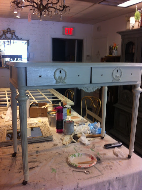
 One of the services we offer at Maison Decor is custom painted furniture.
Sometimes we track pieces down for customers to fit their requirements,
like this petite desk we just finished.  Our client had a small area in a 
remodeled kitchen that she wanted to put a desk, and she didn't want more
cabinetry, she wanted a unique piece to add personality to the space.
It couldn't be too deep or too wide~so I took her measurements and put 
it on our Maison Decor Wishlist of Customer Requests.
Sure enough within a week we found this pretty little charmer.
Of course it didn't look so pretty, or charming, but it had all the details
that makes a piece special and it was just the right size.
 Our client, Catarina, came up with the idea of having white peek 
through a mostly blue colored desk.
We call that two color distress technique and it was a great idea for 
this desk. Distressing it lightly would highlight the carved wreaths 
and the metal key hole as well as the pretty turned legs.
Catarina's pillow was our color inspiration.  
The desk was quite old and we decided to sand the top to make it smoother. 
 Normally we don't find ourselves using a sander~
but this piece had a lot of scribble marks and scratches 
that we wanted to take down a notch. 
 Then it got two coats of Old White Chalk Paint, with a coat of 
Zinsser Clear Shellac in between as this little desk had some 
staining coming through the paint (called bleed).  
The shellac will stop that and you can go right back to painting. 
Then we followed up the Old White with two coats of Duck Egg blue.
After that I started the process of distressing back the blue to reveal the white.

 This is a great technique to show off details like these pretty carved wreaths. 
 And no makeover story is good without the ugly before photo, right?
 The BEFORE shows a neglected beauty 
waiting to come back into the spotlight.
At least thats what I see when I find these pieces! 
 Catarins's desk~another piece of furniture
 saved by Annie Sloan's magical paint!
#chalkpaint #itsmorethanpaint 

Photobucket
Read more »

Sunday, August 25, 2013

One year ago we opened up shop in Boston. Sadly we are closing the doors.


 One year ago we opened our second Maison Decor location
in Boston's south end on Harrison Ave.  Its in an artsy area with little
foot traffic except on Sundays~and that is one of the reasons we decided to
not renew our lease and go for another year. There was not enough of 
the everyday pedestrian traffic to warrant another year.
And the shop was a bit on the small side for a shop that carries furniture.
We had 450 square feet~not a lot of space.


 And so today, Sunday August 25, 2013, will be the day Maison Decor Boston closes its doors.
We plan to regroup and hunt down the perfect city spot for our special little store.
We are having our first sale ever in the history of Maison Decor.
25 % off all the furniture~painted and antiques.
So many shoppers loved our  store~and we did too.  So its a sad day today~
but one I know is necessary for growing our business bigger and stronger. 
 
Justin poured his heart and soul into the shop. 
Every Sunday he and his girlfriend Madison could be found
 in the shop helping customers and ringing up sales while Sylvia played 
the role of the charming store mascot.
It was a true team effort~ Colin did a lot of the behind the scenes stuff like 
getting the inventory in and out and moving furniture to new homes.
Madison would stop in and update our inventory on her way 
to working another job~I was doing most of the buying~
all this made for a fantastic little treasure of a shop~
but not enough people found us on this mostly quiet street.  
So that will be the thing to focus on the next time round. 
As they say in real estate....Location! Location! Location!
 We found that to be true with our first store in Malden~
this too has closed to the public and is now operating as our 
warehouse and shipping center. 
We plan to have occasional warehouse furniture sales here.
 Finding that we needed a better location we lucked out 
in the hunt with our 150 Main Street Reading, MA location.  
This is in a great spot and we are enjoying one of our best months ever here. 
 Of course it is a lot of work to open a new store. 
This is our third store we have opened in a year and a half!
Taking an ugly duckling and making it beautiful~
thats what you have to do, and I very much like the process.
 Using fabrics and accessories to make a place come to life~
and give it a sense of style and identity.
Our Boston store had a different feel than our other store~
and that was part of the fun. 
 So while we hunt for our next store location in Boston we will be combining
 bits of both styles in our Reading shop which I am quite excited about.
Not so feminine, not so urban...
its going to evolve and I think it will be quite wonderful.
 This was the handout we have in the shop this weekend~
our shoppers can find us for updates on instagram and
 twitter as well as our blogs and of course directly in our Reading location.
So long Boston! 
We loved this fabulous little store of ours.
..sniff sniff....
but rest assured we plan to be back, better than ever!

Photobucket
Read more »

Saturday, August 17, 2013

making Life more Beautiful! Mora clocks and lovely things

making Life more Beautiful
That is our tag line~make Life more Beautiful!
We had the sign maker put this on our front window
and I love the feeling it conveys~
make your little world a bit more beautiful in so many
different ways. Painting older pieces of furniture, hanging a new 
piece of artwork, adding a fresh group of items for an enchanting
table top vignette, a new toss pillow....
there so many ways to make life a little more beautiful, don't you think?
 We have been getting in more shipments of lovely things for our shop.
This is the view from my desk and I had to snap a pic with my iphone.
New artwork and tabletop decor items have arrived and its been great
fun to add them to the walls and the pieces of furniture in the shop.
We are still loving our floor~everything looks good with it or on it.
 A set of vintage inspired Pagoda prints are so fabulous!
 I had to hang them by the entryway so you can't miss them!
These are truly enchanting! I imagine this set might just end up in my home, 
I feel in love with them!  Sorry for the reflections on the glass, 
but each vintage pagoda building is surrounded by an etching framework 
of floral and ribbon detail and at the bottom of the framework is 
a different feature, like a ships anchor for the Swansea Mass pagoda, 
A crown and butterfly for the New Iberia, Louisiana pagoda, 
a bumblebee and crown for the Mystic CT pagoda, 
and lastly a crown and fleur de lis for the Mount Vernon Virginia pagoda.  
They are all on an antiqued paper background and 
antiqued black and gold frames. Just wonderful! 
 I made a zebra toss pillow with lime green poms...its darling! 
Really feeling the green mixed with blacks and golds.  
A large artichoke finial and easel clock were added to this vignette.
A tall wooden finial with a hanging clock in black metal 
with a tiny crown on the face
mixes it up in another vignette with green topiaries and orbs.
For those of you patiently waiting on your custom moras, wait no longer!
We had a longer than expected backorder of the last shipment of the clocks.
But they arrived and we made it our top priority to get them painted and finished.
We do them all be hand, each step of the way.
We had a customer who ordered one a few months ago...she was so happy with it
she placed another order to give her daughter one as a gift!
Look at these clocks! All need to be finished by hand!
We have our old Malden shop as our warehouse now so it has
made this part of the job easier. 
Here the clocks are wearing their first and second coats of paint, 
no antique glaze has been applied.
So be advised the clocks will be headed to their new homes 
at the beginning of the week!
Wanted to share this photo Colin took of Justin in the doorway of a brownstone
in Boston this morning.  They delivered a piece of furniture here.
Its a beautiful building, and the painted chest will look great in its new home.
We offer local delivery services to those who purchase furniture from us.
The other service we offer is custom painted furniture.
A customer brought in this gigantic gold mirror 
she purchased at HomeGoods.  Its enormous! 
Its really pretty, but the gold doesn't work for her home and so we will 
be custom painting this mirror in a pale grey with white so it appears
to be a white mirror, but will have the depth to show off all the detail.
When you see something like this at HomeGoods you can always customize
it to your liking.  I will be showing off the whole process next week.
Colin snapped this pic through the side window while I was writing this blog post.
A little birdies view for you~that is my desk and there 
are the pretty pagoda prints on the wall.
Have a great day!


Photobucket
Read more »

Tuesday, August 13, 2013

Adding Patina and Ragging Walls

Thats right, a finger tip of patina...a little bit here and a little bit there.
It just brings out the antiquey goodness in a cabinet I think.
This is Gilder Paste in Patina. It mimics the turned copper look.
I like to use it in tandem with a gold color.
The cabinet is in our Workshop area and it holds our workshop supplies. 
I painted it in Chateau Grey Chalk Paint® by Annie Sloan.
Then I drybrushed it with Duck Egg Chalk Paint.
Followed up with some clear wax and then I was ready to add some patina.
Literally.
 All the moldings got a bit of some Gilder Paste.
I used some Antique Gold Gilder Paste with the Patina.
We sell it online, and I will have a link below. It lasts forever and 
I am still on my first container of all the various colors and 
I even use them in my workshops!
Just remember to add gilding products after you wax.
 Another way to add patina or age is by using paint. This is our lovely little bathroom in the shop. Pretty basic for basic needs...we need to add a bigger sink so we can wash brushes, and I really can't stand the look of a plain jane room~so it got a makeover this weekend.
 I started with a ragged wall treatment using Annie Sloan's Antoinette and Coco Chalk Paints. Big swipes on the wall with a paint brush...then a spritz with a water bottle and then rag it in...add a little here and a little there...the next thing you know you have a marvelous looking wall!!! Its so exciting, its easy, and it hardly takes any time! Seriously! I am going to do some walls in my house!
 Spritzer bottle, two cups of paint, one chip brush used for both paints, and the only other thing you need is a ladder and rags. When a rag gets really heavy with paint, you will change it out for a new one.
 Woah~look at this wall! I LOVE it!!! 
I added some little gilded bumble bees with a stencil from the
 Royal Designs Studio line that we are thrilled to be carrying now in the shop. 
But of course I used my stencil a little bit differently than they show how
to use it. I just placed them randomly about~just a few.
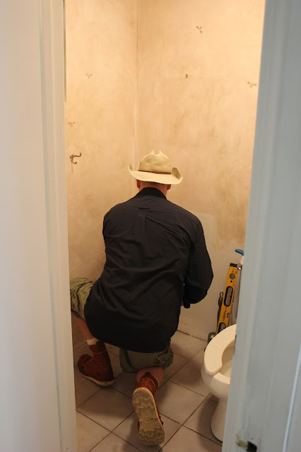
 Here is Mr. Maison Decor in his normal attire...workboots and a cowboy hat.
 I begged asked him if he would help me build a platform for a sink~
an idea I had was to rip off the boards from a wood pallet and make a sink console. 
He was up to the task and after 12 hours it was done...
what a long day that was! Only one period of grumpiness was had, 
and then we enjoyed a nice dinner out. We were both starving and although 
I was wearing my worst grubby paint clothes, I still walked through the doors 
of a restaurant to get dinner. I did make Mr. MD go first so I could hide behind him...
left my pride at the door.  When you are hungry you don't care 
that you are looking like hell in a baseball hat and paint splattered yoga pants.  
He is so much the "ladies first" kinda guy, that it was hard to
 get him to walk first as the hostess ushered us to our table. 
We both laughed and ordered a well deserved drink.
But I digress....another photo of the wall.
I started decorating the walls while the cowboy was still putting in the sink!
More pics to come showing off the  rustic sink console he made for me. 
It was so late that I never took the final shot.
We seem to always have three projects happening at once on
any given day at Maison Decor....
This lime wash leather top desk we have in the shop 
is getting a makeover that will involve creating patina.  
Its bright green leather top sat up on top of all that lovely 
washed out wood beneath it, so I decided to balance it out by decoupaging
 the panels with Laura Ashley's Summer Palace wallpaper. 
To make it feel like it has some age to it, I am working on all the panels
 with Annie Sloan's Craqueleur to make the panels have tiny cracks
 but that you can see the whole image right through the cracks.
 But since its 5 o'clock I didn't finish this project as 
we were pretty busy in the shop today.
Hopefully I will get to post it in a day or two,
 but this is how it is turning out! 
Ok so I showed a bunch of half finished projects...
I promise to get the completed projects up soon!
 We are adding a MENS ONLY workshop for the man in your life,
(unless you are the man reading this, I am talking to YOU).
Justin and Colin will be teaching the guys all the ins and outs of 
Chalk Paint and Wax. Oh yeah, its gonna be a great class!

Thanks for coming to the new store, we love seeing the new and old faces.
And of course, thank you for reading the blog!

Photobucket
Read more »