Thursday, January 26, 2017

Planning for Spring and Outdoor living


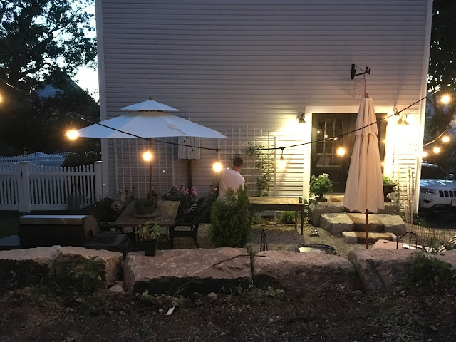
Last year's efforts brought about my French Courtyard with kitchen garden, 
perhaps my all time favorite DIY project ever.  One project after another, both
big and small in nature, were required to get this done so we could enjoy it for the summer
months.  But it didn't happen on a whim, it was the winter months of dreaming of outdoor 
living that started the ball rolling.   Creating a loose plan of enhancing a space and then dreaming upways to make it have both form and function is what I did.  
So have you been doing any planning for your outdoor living yet? 
 Spring will be arriving in a few months time, and now
I want to build on what we created and add some other features to the space.
 One of the big projects was the white picket fence.  If you think you want a fence, 
get quotes from fencing companies in your area.  Knowing the cost is always a great first step. 
This was a project that was hired out, as we live in an area with ledge and fence installation
would prove to be very laborious.  However fencing can be a DIY project at a fraction of the cost.
 Our fence comes in at the top of my list for the additions we added to our home in 2016.
Look around at eyesores or things that have bothered you about your own outdoor space and then spend some time "dreaming" up a way to make it disappear.  I detested this fireplace vent on the backside of the house since it was installed.  But at that time we didn't use this side of the house, so it wasn't a problem.  But as things developed, having a vent on the side of the house was a major issue in my way of thinking.  So, a plan was needed to make it disappear...
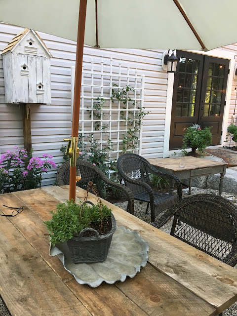
 I got creative and imagined a bird house on a pole that would effectively cover the vent during the summer, which works well, as we don't use our fireplace during the time we are using the courtyard.
 An evening shot shows the bird house on a pole, and it was a great solution to an ugly problem.  Made out of an old wooden crate for a base, I built a little roof and then added shingles to mimic the cute little shed I had just finished resurrecting from the scrap heap.  
The bird house vent cover is purely decorative and wire mesh will prevent birds from settling in and starting their home and families.  The rustic wood plank top to the table was another idea I had to change up the look of my 20 year old wire patio furniture. 
 Planks were simply place on the top of the wire table and then strapped together underneath with thinner pine boards on each end to keep the plank top in place.  Then I  upgraded the chairs to an outdoor wicker set in brown ( shown in the previous photo) that I found at Lowes Home Improvement stores.  These changes made a big difference.
Spend a little time doing some winter planning and Spring daydreaming 
to get the jump on your own outdoor living plan.  
Whether you are a weekend warrior or have more time, 
as I do now, the efforts will reward you on a daily basis.  
My family loves this space that I dreamt up, and so do I.
The cherry on the top of our beautiful courtyard is that Matthew Mead photographed it for his spring issue of Upstyled Home for his special Outdoor Edition (due in Spring 2017).  I have seen the layouts of all the garden spaces, patios, porches and the like, and know that if you are looking for outdoor inspiration with real ideas with remarkable results, you will LOVE this issue!  My own space looked more  amazing when it was presented in print.  I was so proud of it, and it wasn't that hard.  It was an idea that came together with a "things to do" list, and one by one I checked them off.  So get dreaming now, make a list, and then turn your own outdoor space into a wonderful place.  From small secret gardens to family size gathering spots, enhance what you have, 
and it may become your own favorite DIY project too!
PS.  I just learned I landed the cover shot!!
Can I tell you how excited I am about this??!!
A dream come true, now I just have to wait for April to come.

 photo signature_zpsxi5q1w6r.png
Read more »

Monday, January 23, 2017

Today's French Country Style

The lovely French Country style can work in today's modern homes.
This style has fanciful elements mixed with things to take it down a notch,
making it a nice livable style choice.  Mixing in some rustic pieces is the secret
to getting the right mix for French Country style, so you don't feel like you live
in a museum.  Its a style I have a passion for, and I hope you enjoy this post.
Let's take a look at some rooms that have the perfect mix, in my opinion.
Pamela Pierce Design
Everything about this room has wonderful French Country style for today's living.
Rustic and feminine meet to keep the room welcoming to both sexes.
 This home had the stone walls that set the rustic tone, so softness and femininity was added with fabrics and flowers. Look at the accessories: a pillow with an antique toile remnant, a green metal garden dining table used as a console,  old books, weathered finishes on the chair, lamp and shutters, and crocks and vases of a single type of bloom speak to an easy country life style, which is what French Country style is all about.  Bravo Pamela!
Veranda Magazine
A slice of a view of this room from Veranda magazine shows
a monochromatic scheme in camel and white.  The traditional checked
fabric keeps things approachable and the burlap drapery panel along
with sisal carpeting gives the room it's rustic elements. This room is more
French Country Cottage, as most of the design incorporates simple pieces,
with no gilded or fancy accessories anywhere in sight.
Traditional Home Magazine
A beautiful living room with doors that open out onto an 
inviting courtyard has the ubiquitous checkered
curtains flanking the french doors as well as on the upholstery.  
Lots of rustic elements from the walls to the grass rugs and the
 country style accessories make this room a great example of French Country.
It is decorated simply with well chosen accent pieces.
Pamela Pierce Design
Every thing this Texas designer does, I love!  
Pamela Pierce's trademark look is a feminine french style and she
balances it out with an old rustic ambience.  The stone walls create a nice setting
 for the painted rococo table and the slipcovered sofas in linen.  
Her signature is the ruffled slips that you will
find in many of her rooms on sofas and chairs.
 The lavender fabric makes this room light hearted and fresh.   
Veranda Magazine
Grey is the color of the decade, and here it is used in several shades on the 
wall paneling to great effect.  Black and white transfer ware plates
are hung all around the room, a  great French collectible indeed.
Another set of checkered draperies keep this room in the French Country style, 
as you might imagine fancier silk draperies would set a different tone.
The mix of painted chairs with the wooden table is another way this room keeps
to it's French Country style.  The iron lantern light fixture keeps the formal feel
of the furniture from becoming too precious.  I love the mix in this room.
Source Unknown (Pinterest)
This is such a great little banquette dining nook done in French Country style.
A built in library effect was created with flanking bookcases 
and then the area done in mirror behind the built in to visually increase the space.
What gives this room successful FC style is the use of the tan and white buffalo check on the painted French chairs, and the overall tone on tone color palette.  A painted chandelier hangs above a painted
table, and then a random French chair in dark wood is added to take away from the matched set.
A comfy banquette in checked and solid linen pillows makes it quite a charming spot.  What a nice
way to outfit a less than large eating area in a smaller home, townhouse or condo.
French Country style has evolved from this look, where there was tons of color and pattern everywhere you looked.  Toile fabrics, painted furniture and coordinating fabric patterns where once the way to create the "French Country" room.  Now it is a "less is more" kind of look, using some of these elements, but not all of them together.  A more subdued interpretation of this beloved look is a modern way to use French Country style in one's home.  Imagine this room without the curtains, just the shutters.  The table without the cloth, and that the table would be an iron garden table or a simple rustic pine piece.  Painted chair with checkered pad is perfectly fine as is.  Strip the wallpaper and use a neutral white or greige paint on the walls.  Finish it off with an antique French mirror  flanked by some of the transfer ware plates, over the painted blue sideboard, or use a Swedish style plate rack.  Now that would be an easy room makeover with stunning results!  Do you have a French Country room that could use a little updating? 

 photo signature_zpsxi5q1w6r.png
Read more »

Sunday, January 22, 2017

Online grocery shopping and the best Coconut milk

Wow, I have never ordered fresh groceries using the internet before.  I happened to be looking for a brand of Coconut milk online when a suggestion for the Instacart service came along.  So I decided I would give it a try, and order a few things.  Wikipedia defines Instacart as an online grocery delivery service.  I had never heard of it, but I had heard of PeaPod and delivery services offered by the grocery stores themselves.  This is different, as a personal grocery shopper will get assigned your list and then he or she will pick out your items and then deliver them to your home.  I was blown away at how easy this turned out to be.  But would the produce and the meats I selected be as good as those I would pick out myself?  That was the part I was most curious about.
Below are screen shots of my phone as the order started to get filled.  You can watch it in real time, which is pretty fascinating. I placed my order and in about two hours I had my groceries. 


I selected Market Basket, a local grocery store that I like to shop at, 
however you can pick from several stores, Whole Foods and Costco. 
Above is my list and you can leave a notation about no substitutions or
you can have the shopper pick out a similar item.


My shopper's name was Ardyth, and you can see as Ardyth shopped, it goes into the section of "shopped".  If I wanted to communicate with her, I could hit the chat button to reach her as she shopped.
Onions!  
I needed some sweet onions and I hadn't added them to the original shopping list.
So I used the chat button to ask her if she could add them.
 Ardyth wrote write back, "sure".  This was so bizarre, talking to someone who was picking out my groceries. 
 Then she sent me a photo of the onions she got for me.  Yup, those were the ones!
I could see my other choices in her cart, like the sparkling water and the almond milk.
 Ardyth called me when she arrived at my home.  
She pulled up in an older model jeep with her 10 year old son who helped bring in the groceries.
Real people doing real things to make a buck.  She mentioned her son plays football.  I handed
her a tip, and off she went.  You can tip through the app but I read some reviews about the tipping process and you can do it that way, but I thought this way it will go directly to her.
 And how about the produce?  It was just as nice as what I would pick for myself.  
The chicken was perfect as well.  One thing I wanted was some Chicken Party Wings for
the Patriots game today, but they were sold out, so that was noted and I was not charged.
In the end, you get a grocery receipt for what it actually cost and you do pay a little bit more per item as well as a 10% service charge and then tip on top of that.  I think this service is a great option for quite a few categories like those who can't get to a store, those feeling under the weather, the elderly who want their groceries but don't want to take a shuttle bus or rely on others, or those who want to avoid the weekend crowds.  If I broke my foot or had the flu, I know I can still shop for our food!  And I think of my parents, in their 80s in Florida, they can use this service right from their iPhones.  Mom and Dad, how about it?  It really was easy to use! 
One must go to your Apps on your phone and find Instacart and then download it to your phone,
and then you can set up your own account and pick the store you want to shop from.
 It all started because I was searching for this one brand of extra delicious Coconut milk.  The one in the middle there is the winner.  Why, you may ask?  Well hubs and I are doing the Whole 30 diet plan again for 30 days and we cannot have any dairy, so we use this in our coffee every morning.  
And it is simply the best we have tried, and we have tried a lot!
Evergreen Coconut Milk.  Simply the best. 
(Note: this post is NOT sponsored, it is just a passing along of 
information I hope you will find useful.)
 photo signature_zpsxi5q1w6r.png
Read more »

Tuesday, January 17, 2017

How to Pick Paint Colors: Magazines vs Real Life

 Color: Benjamin Moore Aura in Woodlawn Blue #HC 147
Picking wall colors can be daunting, and the best way to find a good one
can be locating a color from an online image or a magazine, but then you must
follow through and get a sample of the color to put on your own walls.
The reason is that magazines can saturate or lighten up actual results and the 
color will be very different than the one you admired.
Often asked questions on my blog are about my own wall colors.
They want to know the name and brand of the paint I use for certain rooms.
Our living room was painted a year ago in Woodlawn Blue.
  This blue has a bit of green to it, and its such a pretty color.  
Things that are more blue make the walls look green,
and things in the room that have more green make the walls look blue.  
The color will be darker when it is cloudy outside or at nighttime. 
The blue will vary on each wall, depending upon the lighting.
My camera may lighten up the color too, depending upon the setting
I use, but this color is pretty much how I think it looks, at least on my screen.
But take a look at how it looks in the current issue of Romantic Country magazine.
Its more aqua, and every color in the room is more intensified, from the 
pinks to all of the blues.  The blue wall here is more aqua than this color really is,
so never pick a color from a magazine photo without testing it first.
 That being said, I love love love this blue paint!
Color: Benjamin Moore Regal in Natural Elements #1515 
Our dining room walls are a taupe color that has a warm tone.  
Some taupes and greys are cool, and some are warm. 
 I have not tired of this neutral color one bit. 
The woodwork is White Dove by BM.
 This bench is in the dining room, and so the wall color 
is the same as the rest of the room.
It is a nice neutral, very light and it appears to go with everything.
 This is the same bench and wall in Romantic Country magazine. 
 The day of the shoot it was so gloomy and 
so lighting was used to simulate daylight. 
Notice how the wall color looks to have a green undertone. 
 My hallways all have the same color, Natural Elements, with White Dove trim.
Using one neutral color will unify the spaces when you have open spaces.
When I painted the living room walls blue, I had to pick an ending point for the
blue color, and you can see right there in the corner by the door how it looks. 
 Benjamin Moore Natural Elements #1515 in matte finish
 Behr paint from Home Depot in Contemplation
Our bedroom was the most "styled room" in the photo shoot for Romantic Country,
as you will see below.  But here it is as we normally have it, mostly blue and white. 
The wall color is also another pretty blue with a green tone.  
Romantic Country Magazine image shows the walls to be more intensified.
So when you love a wall color in a magazine, beware!
Benjamin Moore Aura Spa in Simply White
Our master bathroom's walls are in last year's Color of the Year 
by Benjamin Moore.  I used Aura Spa on recommendation of my paint 
guy at the local paint shop and I hated this paint.  It is supposed to have a 
built in agent to resist mold and mildew, which we really did not have any 
issues with anyway.  What I found was that I needed three coats to cover 
the beige paint that was on the walls, so the effort was incredible to just paint
the walls white.  Next time I would use plain Aura (as it has no VOCs) and
I think it would have been two coats to do what took three here.
But I digress, as we are talking about how paint colors differ from images
found in magazines and in real life.
Can white look different in a magazine?
The Romantic Country magazine image has lightened everything up and 
all of the colors are intensified, and the white looks brighter.
I do love the color, Simply White.  My woodwork is White Dove.
The bathroom cabinet is the same as the wall color
 in the bedroom, Behr Contemplation.
Picking out samples from a paint store can be the most difficult thing to do,
and my recommendation is to pick what you are attracted to, then dial it down
and select a color similar but a lot lighter and a bit muddier.  It will look
more sophisticated instead of something that came out of a crayola color box.
Benjamin Moore Aura paint, Basil Green #2029-10, matte finish
Unless that is what you are going for, lol!
My son, Brandon, an artist from Los Angeles, picked this color out.
Turned out a month later Pantone picked a similar color 
as the color of the year for 2017.
This color has more yellow in it, than our green does.
I would have gone with a color that was more subdued and darker, 
but in the end it is a very fun color and everyone loves it.  
It "needs" things on the wall to balance it out, 
and the black and white is a great neutralizer to its boldness.
When Fifi O'Neill arrived for the shoot, she looked at the tv room 
and said, "oh we won't be shooting this room, it is not romantic at all".
That made me laugh, and of course it is true.  It would have taken 
a flower cart filled to the brim to bring romance to that space.


 photo signature_zpsxi5q1w6r.png
Read more »

Monday, January 9, 2017

Signature Swedish Style: A visit with Designer Sandra Kelly

 I first learned about Swedish style maven Sandra Kelly at Brimfield, last May,
when my son and I set up our own booth at the Brimfield Antique Fair.
 Sandy's style was unmistakable and never did I think in just a few months
 I would be visiting her home with Matthew Mead for a photo shoot.
Sandy styled her booth with a sense of beauty and order.
 Sandy had some art panels done by a favorite artist, Jennifer Lanne of New York,
 who also had a booth at the May Brimfield show.  You will see some of these pieces 
in the interview video at Sandy's home, so keep your eyes open. 
I fell head over heels for the painted french chairs, and the overall atmosphere of her magical booth.
Fast forward to our visit in a few months.  Her home would be just as enchanting! After the shoot, we set up our video cam and shot a Q and A with Sandy about her signature Swedish style.  We hope you enjoy this interview at Sandy's beautiful country home.  Her home is also featured in Matthew's current issue of Upstyled Home, the winter edition, on newsstands now.  Enjoy!

 photo signature_zpsxi5q1w6r.png
Read more »