This summer we did some upgrading of our countertops in
both the kitchen and the master bath.
I realize I never blogged about them. Why?
I guess I never thought the kitchen or the bathroom
looked neat enough to take a bunch of photos.
But since Fifi was coming out for the photo shoot
I did take a photo of the kitchen right before she arrived.
The lights were on, as it was a dark and dreary day and so the pic looks yellowish.
Ugh.
When a few images sneaked onto the blog a few weeks ago,
a sharp eyed reader and pal demanded to know all about them!! So Nita, here you go!

With the new counters we got a new sink!
Out went the old washboard porcelain vintage sink. Which I did love.
Green canisters from an Etsy source and an old tole chandelier
and then some green toile curtains I made are the other new additions to the kitchen.

One version of my old kitchen (for about a year),
was this one with the bright green paint on the beadboard back splash.
I did get tired of it, and then repainted it white...but it does look pretty here.
Anyway, I love my new counters with the undermount sink
as it gives me more countertop space to the left and the right of the sink,
which I really needed.
Overall the "new" kitchen is still very cottage and cute.

Another new (minor) change was I decided to paint the
laundry room/ bathroom cabinetry black.
After I painted my new French Doors black, I thought they looked incredible...
and so I got the idea to do these cabinets.

I love the look, and even though we didn't change anything else,
the room feels very different. In a good way!
Black is becoming a slight obsession with me,
and I realized this after doing several projects using black, or black and white.
Always a classic, black just has a classy look about it.

This was where the black fixation thing started...
with the exterior paint on the french doors.

WOW! They looked so fantastic!

So then I painted the little french door for the shed black...

And that looked really cool...so then I made a new umbrella cover
in black and white copying the pattern from the old covering.
Its all so chic, in black and white.
 And then the black and white buffalo check curtains (Country Curtains)
in the TV room with the black and white rug (from Overstock)
But I digress...

in the TV room with the black and white rug (from Overstock)
But I digress...

The other countertop upgrade was in our master bathroom.
This was a major improvement!
Going from formica to stone is just a huge change!!
We both love the difference it made in how light and airy and rich the bathroom feels.
The countertop is quartz and its in white with grey and bits of aqua and celery green.
Really very pretty stone, and so the cabinetry was painted in a pale aqua blue
to enhance the coloring in the stone.

So that led to me adding a few french crystals in aqua to the gold chandeliers,
as well as painting the closets in the same shade as the vanity.
The walls are Simply White and its all very bright and happy in this space.

This was the former space. Theatrical French Lady Style.
All done in pink and cocoa with gilded accents.
Pretty, but I think we were all ready for a change.
(Note the old formica countertops that were a dark grey color.)

When Fifi styled it for the magazine, she put back the pink hooked rugs.
It looked really pretty that way too, because my towels have pink in them.

Fifi wanted to know why I didn't paint the door aqua too?
Hmmm, I just thought this time, it should be white.
But maybe she is right.
I think she probably is right.
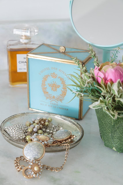 (Speaking of the Fifi Photo Shoot, she sent me a few images I can share...
so here is this one from the bathroom of course!)

so here is this one from the bathroom of course!)
Anyway, those are the new changes that missed being called out in the blog,
so here they are! Its been a fun and busy summer and maybe the courtyard
and our new fence overshadowed some of these other home improvements.