

I always wonder when we Americans think we are
painting our furniture to look authentically French, are we?
I guess I won't have the answer
I guess I won't have the answer
until I get over there and see for myself.
Until then, here are some examples
in Country French magazine that I like.
in Country French magazine that I like.
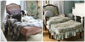
French painted finishes~
The round table has gilded highlights on a grey paint job.
The bergere chair has a white washed or limed finish.
I love the look of both of them,
especially when they are put together!
especially when they are put together!
I got ideas of how I wanted to paint my secretary
by looking through Country French.
by looking through Country French.

Same room, full view.
Check out this trumeau mirror in "Paris Grey" with gilding.

Here is a french version of a shabby chic room
with a gorgeous trumeau mirror.
This mirror could have been chalk painted with Paris Grey
and then antiqued with antique wax and then gilded....
just like my secretary!

The antiqued panels have an old olive green color,
which reminds me of that french trumeau.
All of which makes me very happy, of course!
In the meantime...
In the meantime...
I discovered a funny thing while looking at my old back issues.

Check out the trumeau mirror on this cover shot
for the 2010 Country French magazine.
A pretty french blue mirror with bright yellow walls and bright pink flowers.
Notice the color of the table and the chair frame....
Does it look familiar?
It is the same image the magazine ran for interior article
in 2007 in reverse with paler colors.
The whites are ivory, the blue is grey, the bright pink is soft....
the only thing darker is the curtain rod.
The whites are ivory, the blue is grey, the bright pink is soft....
the only thing darker is the curtain rod.
Pale and creamy palette vs colorful and vibrant.
The same room~two different palettes.
If only we all had the chance to see our own rooms done in two ways.
That would be ideal for those of us who can't quite decide.

I used to be colorful and vibrant,
but now I am more pale and creamy.
but now I am more pale and creamy.
Which color palette do you prefer?


These photos are all making me drool! =)
ReplyDeleteI would like to try the creamy shabby thing in my living room but I have beams in there that are dark wood. I also have a rustic dark would beamy kinda of fireplace mantel which we made when we moved here. I noticed that the beams in one of the pictures are painted white/cream color. I wonder if I would like them like that. I remember hacking away at the wood beams before we put them up. I used a hatchet for that purpose and then I hammered nails in also for the wormy look.
ReplyDeleteOh, on the aside. I have all the windows painted right now and am ready to put them together on the first good day! I'm so excited that I want to make one for my Mom also.
Thanks so much for the inspiration!
Linda
Any I adore the secreatary as well as the first image. Gorgeous paint finishes!
ReplyDeletexoxo
Karena
Art by Karena
So you're thinking like I'm thinking that the two shots of the same room are just the results of computer editing and flipping the photo. Weren't you clever to notice that. Makes you wonder which one is closest to the true colors.
ReplyDeleteEither way, it's a beautiful room!
Those are gorgeous photos and your home is beautiful. I love a pale and creamy decor as well.
ReplyDeleteHi,
ReplyDeleteI just discovered your blog, not sure how I got here, anyway I love your decor and I just read the whole thing about making a greenhouse out of windows! Love it!
I moved to an unusual house last summer in the woods - a picture of it is on my blog (only started two months ago, so bear with me).
http://house of beautifuldogs.blogspot.com/
It was built in 1957 by two (male) artists to copy an Italian villa - with only 2 bedrooms, stained glass, and a spiral staircase inside, ceramic tile floors. And a greenhouse off the second bedroom.(!!)
I love living here. I was shabby chic before, now getting European, sun garden before, now getting shady. Nice to meet you! I'm a new follower, Linda
Interesting about those two photos... the pale and creamy is definitely my favorite. Your house is looking WONDERFUL Amy ... you have been working so hard and it really shows! Good job ;)
ReplyDeleteI'm drawn more to the pale and creamy, Amy. I'm actually debating between a light gray or Heirloom White for a small dresser I just got to redo; with a glaze over whichever I go with. I'm just not sure where I'm going to put it so I want it to be as "friendly" with the rest of my house as I can make it.
ReplyDeleteSuch beautiful photos...my 16 yr. old daughter is going to France with school...I'm soooo envious...I have never been...someday...can't wait to see her photos...xo, Mariaelena
ReplyDeleteDreamy photos! I waver on what palette I like. I think the seasons have a lot to do with it. Part of me really likes the warm cozy look and the other side of me likes creamy and light. I break the rules by having both in my house.
ReplyDeleteYour living room looks so light and airy. Love it!
I am definately more colorful and vibriant in my country French decorating....But I love both looks....I even love the dark old world chateau look.
ReplyDeleteHugs,
Penny
I love the pale and creamy even though I have a darker look as I have dark lawyers case paneling in living area......and the wood in kitchen is very high quality so it prevents me from going completely creamy so I have to use contratst. Love your pictures! I do love the bright pop of fresh flowers in your room.
ReplyDeletesherry
Just like you Amy i used to be colourful and vibrant. I find now i want calm, soothing colours. Life gives enought stress i want to come home to a dreamy soft interior.
ReplyDeleteI just love your secretary now!!
The muted colors are gorgrous, but I could also live with that pretty blue; not my usual color, but the French have the most marvelous shades of greyish blues. Your secreatary captures the French style perfectly
ReplyDeleteMimi
I so dream of a bedroom that feels like this. You motivated me to paint some old bookcases I have in my son's room. I think I'm going to move them to my daughter's room and see if I can get her to go for painting them gray and guilding the trim gold -- like your secretary. Thanks for the idea. :)
ReplyDeleteBeautiful images. I absolutely LOVE the finish you did on your secretary. Your room is just gorgeous... it should be in a magazine. I think the image with the bolder colors is pretty, but I am also with you in that I definitely prefer the softer, paler palette in the other picture.
ReplyDeleteLori
I'm with you Amy. I like pale and creamy. In another life I preferred color and I often wonder, what was I thinking!!
ReplyDeleteGive me calm and serence and I'm happy.
hugs
Sissie
Pale & Creamy is my vote..wonderful photos!
ReplyDeletePale and creamy!! I want to save my pennies and some day make it to France... I may never come back :) I hear they have incredible flea markets among other things...
ReplyDeleteI am definetly pale and creamy. I can't believe how just a few short years ago I was just the opposite! Amazing what a difference a few years makes!~Hugs, Patti
ReplyDeletegood observation, amy! enjoyed your photos...verbena cottage
ReplyDelete