

The clock is soft blue and white now~
Blue or creamy white would be the color I would pick if
I buy an old Swedish clock...

So it was natural for me to want to make
this reproduction as close to the real thing in my mind's eye.
I mixed up a custom color of Chalk Paint
to come close to a color called Glass Slipper that I love.
Essentially using Louis Blue and Old White together,
I was able to copy this Ben Moore favorite.

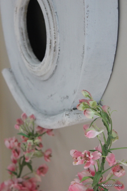
The crown at the top of the clock has a pretty little
french looking heart and lacey carved details.

Overall I am quite pleased, however,
I still need to wax it. A little dark wax
will add some age without darkening it too much.
I'll show this wax step in more detail as I was
asked to elaborate on this process by a reader.

Initially I thought I might keep the dark ochre color
with the pale blue, but when I hung it up on the wall all
you really noticed was the outlines that the ochre called attention to.
There was too much of a contrast, so I used old white Chalk Paint®
to lighten the accent areas.
I wanted two colors, as many of the examples I studied
of antique moras used white as accents on pastel pink or blue bases.

I've sold quite a few of these clocks.
They are wonderful decorative pieces.

The original color was a favorite of many who commented~
but I like it soft blue.
And of course, I hung it a little lower
and so then I had to lose the little chair~

The inspiration for the clock to be blue
was that pale blue chintz pillow~
That wonderful old Mario Buatta chintz
is going to be back in my bookcases soon,
and this room will feel like springtime in Paris!


Amy,
ReplyDeleteI really like the softer blue on your clock - and hung lower, with the flowering stems below - everything looks just beautiful!
Jan ♥
Looks beautiful Amy. I love it!
ReplyDeletehugs
Sissie
Yes! it's getting MORe A CLOCK in your hands.May be light gold touches to edges for making a silhouette, who knows? except you:)getting better day by day.Loves.
ReplyDeleteOh, I forget.it looks very good together these lovely flowers.
ReplyDeleteOh that would have so scared me to paint, but of course your eye was right. Looks fabulous. And a tad lower was perfect.
ReplyDeleteAmy, I love your decor. The clock fits better being blue:)Smiles to you, Susie(She Junks)
ReplyDeleteThe softer colors go so much better in your room. I love the way it turned out Amy!
ReplyDeleteSo beautiful Amy...love the soft light and how soothing everything looks! I could definitely sit there for a few hours!
ReplyDeleteLorraine
Looks lovely, Amy!
ReplyDeletexo
Claudia
I like the updated clock. Beautiful soft blue color.
ReplyDeleteVery pretty, Amy. I works so well with your decor now. Love the color. Most of my paint colors are a mix.
ReplyDeleteThat turned out great. Love the softness of it.
ReplyDeleteAmy it looks beautiful,love the blue and white and it looks stunning in your room x
ReplyDeleteJust beautiful as I knew it would be!
ReplyDeleteIt looks great, Amy! I love the way the light blue turned out. You're right the accent pieces were too dark and detracted from the piece. I like them painted the same color. It comes across almost white on my computer but I'm sure the soft blue is much more apparent in person. LOVELY! xo Diana
ReplyDeleteAmy, it looks great. So perfect for your home
ReplyDeleteStacy
Oh yes, nice color choice, Amy! It looks wonderful and it fits in perfectly with your living room.
ReplyDeleteOMG! That is so gorgeous. Thank you so much for this series on Mora clocks. I have learned so much. Please, please share your recipe for chalk paint.
ReplyDeleteI love the new color! Even though I loved the original color too, I can see why you painted it. The new color works better in your room. I like the flowers below it to soften it and add a bit of pink color to it.
ReplyDeleteLove the color and I can't wait to see what the wax does ... am I the only person on the planet not using AS paint and wax? I want to try it but it's so expensive and I'm not sure if I was to buy only one color which one it should be...advice!!??
ReplyDeleteIt's beautiful Amy!
ReplyDelete♥Charlotte
PERFECT!! Once again you nailed it....gorgeous!
ReplyDeleteSuch a fabulous blue and so perfect for your room. The spring branches beneath are a wonderful touch. Can't wait to see it all when you bring back the floral background to your bookcases.
ReplyDeleteYour painting talents and technique are just amazing!
ReplyDeleteHi Amy~~~
ReplyDeleteYour clock turned out so pretty. I love the paint combo that you used. It really looks original. Great job and the clock looks perfect in your home. I would love to have a clock like that,
Saw you in Romantic Homes...congrats
~Cheryl
FANTASTIC! I know you were thinking you would 'make due' with this one until you found what you really liked... but Girl, you did it! Beautiful - Thanks for sharing... the room is more gorgeous everyday! Jalon
ReplyDeleteI am so excited to see this--it looks fantastic! I love the blue, and I love that you call it "Swedish blue". It looks so gorgeous with your chandelier.
ReplyDeleteLOVE the clock!!! The color is amazing!!!
ReplyDeleteAmy ~ that looks amazing! I can't wait to see the waxing part! ;)
ReplyDeleteBlends in much better , a softer take on that color looks great!!! Blessings Lori
ReplyDeleteOh, Amy.....it turned out beautifully!!!! I love this color soooo much better - and it matches your gorgeous French pillow just perfectly! GREAT job, sweetie! No wonder you've sold so many!!!!! ♥
ReplyDeletexoxo laurie
It turned out so beautiful Amy~ I love the new colour so much. xo
ReplyDeleteLove love love how it turned out Amy. And I like the new heighth. You are so good at what you do. This goes so beautifully with the rest of your room. Lovely simply lovely.
ReplyDeleteI would have been a little nervous doing the painting, however it looks beautiful Amy {as does everything} You've done a wonderful job!
ReplyDeleteAmy, I LOVE your Moira clock, the color looks perfect, it looks beautiful. I like it better hanging lower, and it looks so pretty with your cherry blossoms. Where did you put that sweet little chair, it's wonderful too...
ReplyDeleteDo you have any more of those clocks, because i sure do like yours... I'm thinking one would look good in my house too ... !
Cindy
Looks beautiful Amy!!!
ReplyDeleteIt fits perfectly in your home. As I'm sure you know, the Swedes are influenced by the French. You can see it in the old part of Stockholm, Gamla Stan. My grandparents (Mormor & Morfar) didn't live that far from there in Kungholmsgaten. Has your husband taken you to Sweden? Where in Sweden is he from?
ReplyDeleteAmy - look at you! You make a true Swede proud! (And I like how you lowered it on the wall).
ReplyDeleteWhat, your husband is from Sweden?
Need to know more!
Happy you stopped by so I found you. I am signing up for your feeds.
Kram!
Mon
Beautiful as usual and I think it looks better hanging lower. The room is so light and airy and completely cozy!
ReplyDeleteAbsolutely Beautiful!! You did an amazing job. I love it.
ReplyDeleteHello amy,
ReplyDeleteWell done...it's gorgeous!
Janet xox
The Empty Nest
You transformed a beautiful clock into a gorgeous masterpiece...I love the difference it made to the clock and the entire room for that matter!.
ReplyDeleteThe blue and white is perfection! Your home is one of the most gorgeous in blogland.
ReplyDeleteAmy.....it is beautiful. You did a fantastic job and I love that you hung it lower.....such a pretty room!!
ReplyDeleteAmy, you did a fantastic job. I love the color you chose. The room looks fabulous.
ReplyDeleteHi Amy,
ReplyDeleteI just realized you combined 2 existing paints to create this color. I originally thought you made your own chalk paint. Disregard my request for the recipe! Once again, it is gorgeous!
Wow Amy this is beautiful you are so lucky at finding the perfect projects. This clock has a lovely character to it you have done a brilliant job.
ReplyDeletePerfect color combination - that's exactly how I would of painted it. Well done!
ReplyDeleteHope you have a great weekend and enjoy your newly painted clock :O)
I so love your blog. Such inspiration and beauty. thank you!!
ReplyDeleteHello Amy!
ReplyDeleteI was doing some wallpaper work the other day and thinking about you. You have no idea how much I learn w/ you around here! Thank you for inspire and teach us.
Your living room is a dream.
Have a blessed weekend.
xo
Luciane at HomeBunch.com
Amy, the finish is gorgeous. The custom color you mixed is perfect and what a great choice you made in doing the accent areas in an off white. I absolutely love how the face of the Mora looks with your new finish. Stunning!
ReplyDeleteLori
Gorgeous, gorgeous, gorgeous!!!
ReplyDelete