

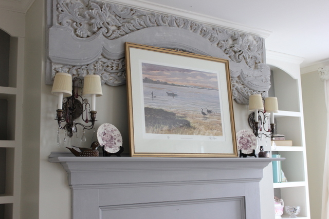
It only took about ten minutes living with out this carved piece above the mantle~
before I decided it needed to be hung back up above the fireplace.
In architectural terms, this piece is called a "frieze".
Wikepida: In interiors, the frieze of a room is the section of wall above the picture rail and under the crown moldings or cornice. By extension, a frieze is a long stretch of painted, sculpted or even calligraphic decoration in such a position, normally above eye-level. Frieze decorations may depict scenes in a sequence of discrete panels. The material of which the frieze is made of may be plasterwork, carved wood or other decorative medium.

So while my newly made over mantle post was sent to
BlogHer for approval, I got busy with the can of Paris Grey chalk paint.

The Paris Grey on the mantle was very appealing to me~
but without the frieze it had lost its romantic mojo.

I brushed the Paris Grey over the frieze, leaving the nooks and crannies in white.

I hung it back up on the wall and was thrilled with how it looked in Paris Grey.

This watercolor may not be the best choice,
but it will stay until something better comes along.
Reading all the comments yesterday about how many of you
were holding out for the return of the frieze made me smile.
I hated that you had to go through it yesterday~
seeing my mantle frieze-less!

So its back~

And its here to stay!


It looks great! It looks like it was made for that wall since it is such a perfect fit too.
ReplyDeleteI am so glad you put that back up, Amy! I love that piece above your fireplace! It does look great in the Paris Grey. I have a sample pot of that color and painted a small stool with it and my picture makeover that I used the chalkboard contact paper on.
ReplyDeleteAmy, I am so glad to see it back! I saw your post yesterday or a couple of days ago (I'm still trying to catch up!) and hoped you'd put it back. The room looks great. I LOVE that chair to!
ReplyDeleteNancy
Amy that is absolutely gorgeous!!!
ReplyDeleteThats What I'm Talking About!!!!!
ReplyDeleteI'm so glad that you put it back. I didn't have the heart to tell you yesterday that I really liked it better with it.
Looks so pretty in the paris gray.
Love it. I'm happy now.
hugs
Sissie
Hi Amy,
ReplyDeleteDon't ever take your frieze down again it is beautiful!!!!! :) it looks amazing in grey! i love your new look but i have a soft spot for those floral boards,they are really pretty,its cool how you can change it up though through the seasons.
Just looking again,the frieze and wall lights just look so great together,love them x
It looks lovely in Paris Grey!
ReplyDeleteYou have found the perfect spot for the frieze, and might I add the perfect color!! Love the gray, its very sophisticated and oh so French!! Tres Jolie Amy!
ReplyDeleteI am so glad you decided to put it back up...just too too gorgeous to leave out!
ReplyDeleteThat's Better! (sigh)
ReplyDeleteAmy,
ReplyDeleteYour room turned out really pretty, as usual. I am trying to choose a grey color for my bedroom and I am wondering which color you have on the mantel wall besides the Paris Grey. It looks like a nice neutral, that goes well with all the blue and pastels. I am afraid to put a grey that has too much blue in it on my walls. Is it the same color you have in the dining room? Another pretty room. With the wallpaper accent wall and everything. Your help would be appreciated!
Hi Amy!! I'm a new follower! I love how your mantel turned out, that looks great! I'm finding lots of things to pin on your site!! =)
ReplyDeletehttp://thelatestfind.blogspot.com
Hi Anon~my wall color is a benjamin moore color called natural elements #1515, and it is made up in the Valspar signature paint line, which is one coat coverage and it truly is fantastic! I think this is a warm grey like you are looking for.
ReplyDeleteOh my gosh Amy, now that the frieze is painted gray, i think the painting looks really pretty there! It's all so soft and pretty... I really really like this look! And, i like the way the brown chair looks with it all, something about it is really good in the room, i'm not sure how to define it, maybe because it picks up the color in the sconces and grounds things or something... This is a gorgeous look!
ReplyDeleteCindy
Amy, you have shared your home with your bloggers so now you only get to do the work, we're part owners and we get to enjoy. The fabulous frieze would be pretty regardless of the color. I'll be looking for the floral panels to make a return engagement. They take my breath away!
ReplyDeleteıt s very very nice ı like it
ReplyDeleteAmy, I don't know what got into you by taking the frieze down.... but I do understand... LOL With it being back up with everything painted... it's now the big Wow factor. I can't wait to see what you come up with to replace the picture... don't get me wrong the picture itself looks great, but I do see something else in it's place.
ReplyDeleteYou certainly keep us interested-
Enjoy your Day~
Amy ~ yup, you got your mojo back, well, your mantle's mojo! It looks beautiful! ~Stacy~
ReplyDeleteIt is a beautiful Architectural piece. So great that you are not afraid to paint it to change things up. It is a great addition to the room in the grey color.
ReplyDeleteHi, I love love your blog your idea's are amazing,love it all. I'm new to blogworld so please check out my blog sometime...Still working on trying how to figure out a header for the top of my blog...Blessings Lori
ReplyDeleteLove the frieze! I'd try the mantel without the watercolor. You have such beautiful accessories there and the frieze won't be covered up. Glad it's back too!
ReplyDeleteAmy, I have always been in love with this piece. If you ever decide to sell it I get first dibs. Hugs, Sherry
ReplyDeleteAmy,
ReplyDeleteThank you so much for giving me the name of your wall color. I agree that Valspar is an excellent paint, and I have used it in most rooms in my house. Do they have the Benjamin Moore color formulas at Lowes or do you just have them scan the color sample? Thank you again, and I really appreciate your help!!!
Yes that is a keeper! It adds so much to the room. Lovely.
ReplyDeleteI actually like it with and without the frieze because the colour foundation really works.
ReplyDeleteThis is your statement piece! The frieze makes your mantle and it looks beautiful. A nice floral picture or painting would have the romantic look you are famous for. Is this Annie Sloan paint easy to use? I haven't tried it but it is everywhere in blogland..Thanks for sharing all your decorating ideas.
ReplyDeleteIt definitely needed that, I might add a little of the white that you have on the bookcases and some gold to give it some more depth. Not that you don't know what you are doing : ) Just an observation :)
ReplyDeleteLooks great....like it was made for your room!!!
ReplyDeleteWOW! WHAT A DIFFERENCE!!
ReplyDeleteBLESSINGS
BARBARA JEAN
Yes, the frieze must stay. It's perfect in that spot. I love it in gray.
ReplyDeleteLove the frieze, keep it!
ReplyDeleteI'm following you through Linky followers, sure wish you'd follow me at citicasita.blogspot.com
Diddie